|
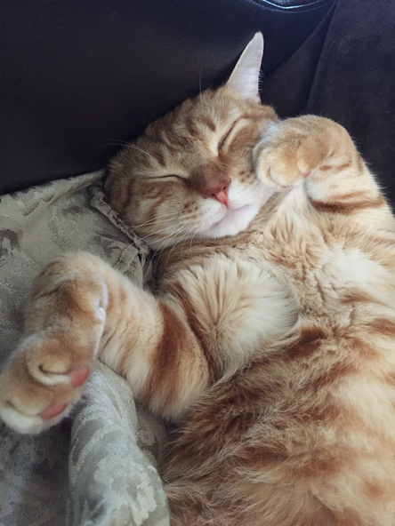
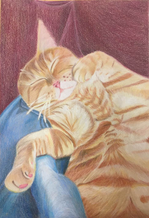
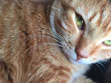
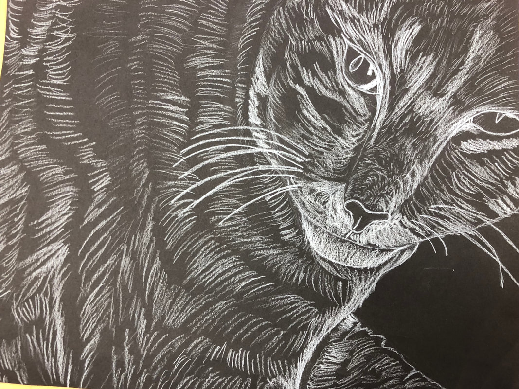
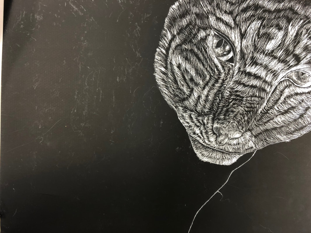
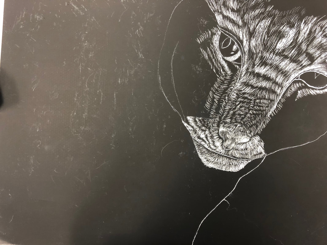
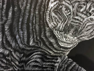
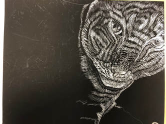
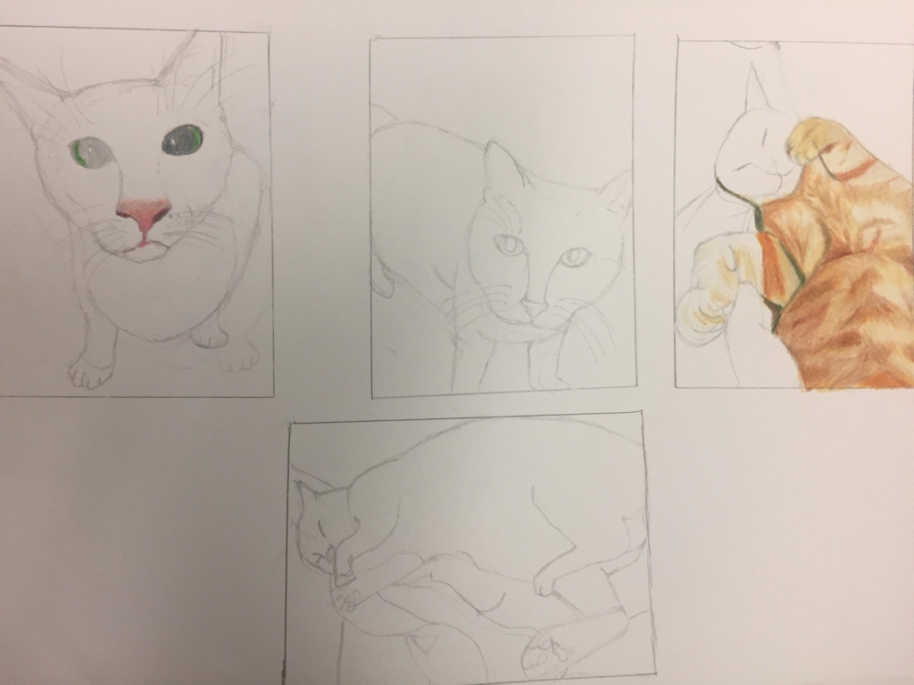
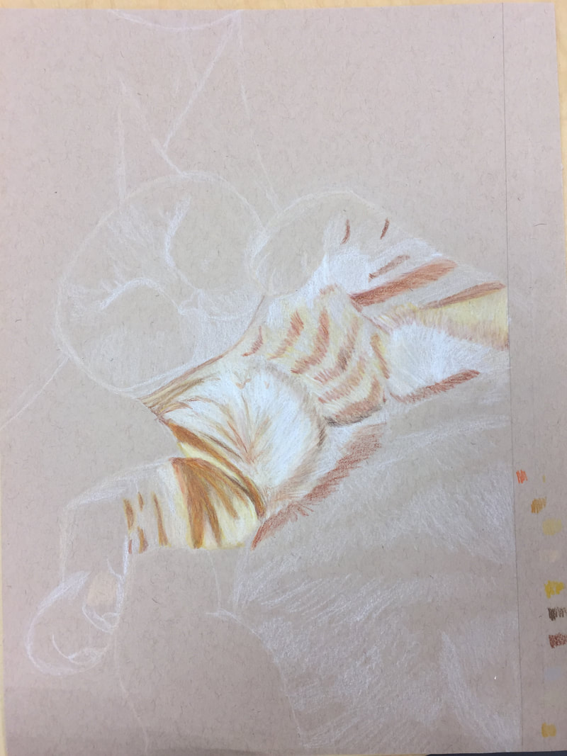
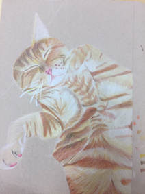
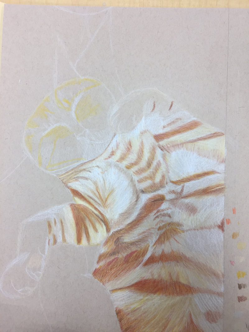
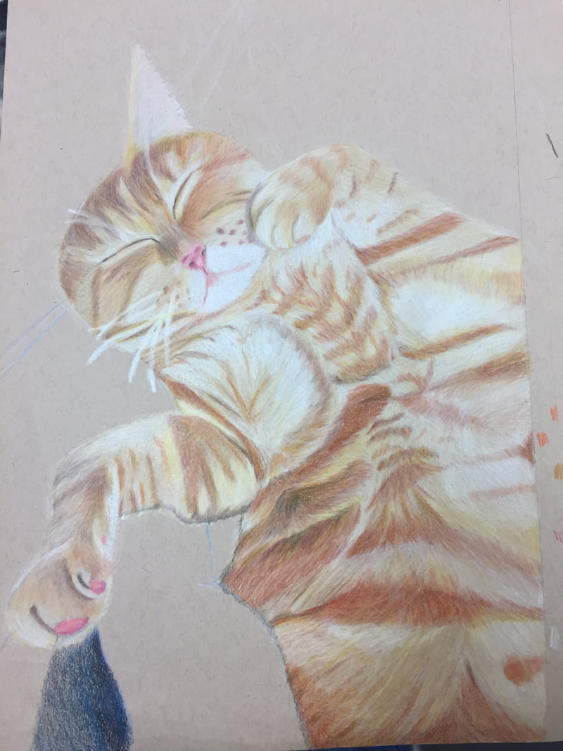
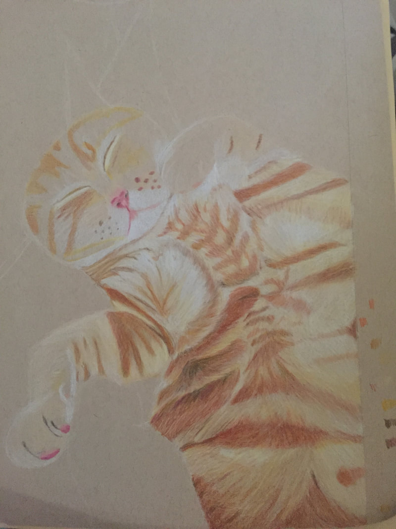
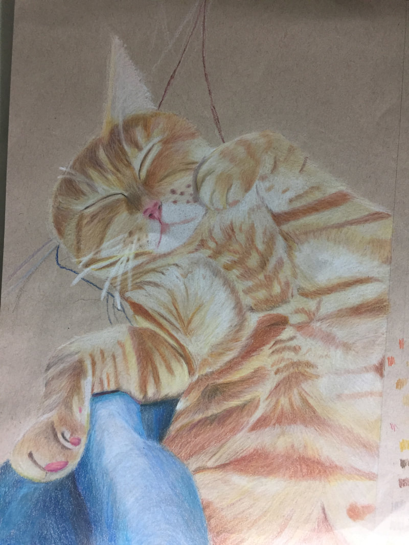
Wow. This class was certainly interesting. I'm not gonna lie, the first few weeks I was super stressed because I didn't think I could get anything done in time nor did I think my artwork looked great. However, as the time went on, I grew to love this class and most of the projects we did. I learned a lot about prismas, chalk pastel, scratchboard and pencil. My favorite project that we have done in this class would have to be either the foreshortening one, and the still life one. The foreshortening project was of my cat and I loved how I captured the fur with the prismas, especially since it was the first time I had ever used prismas. The still life was an agonizing project but I am proud of how it turned out because there were so many details that I tried to capture and it took me forever to get the proportions right. I'm glad that I took this class because I was able to learn different techniques when it came to scratchboard and drawing realistic faces. I also learned to always push the darks and that the yellow chalk pastel doesn't go over any of the other chalk pastels.
0 Comments
 1. Explain the process you went through to develop your drawing.
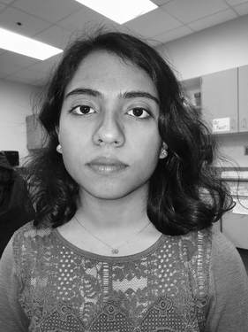
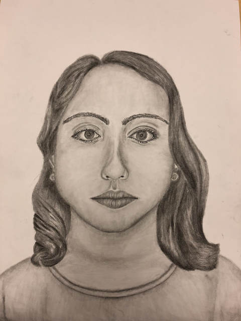
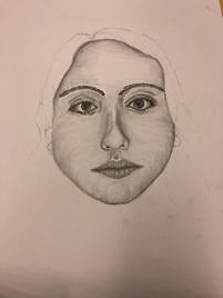
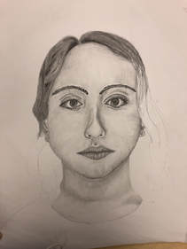
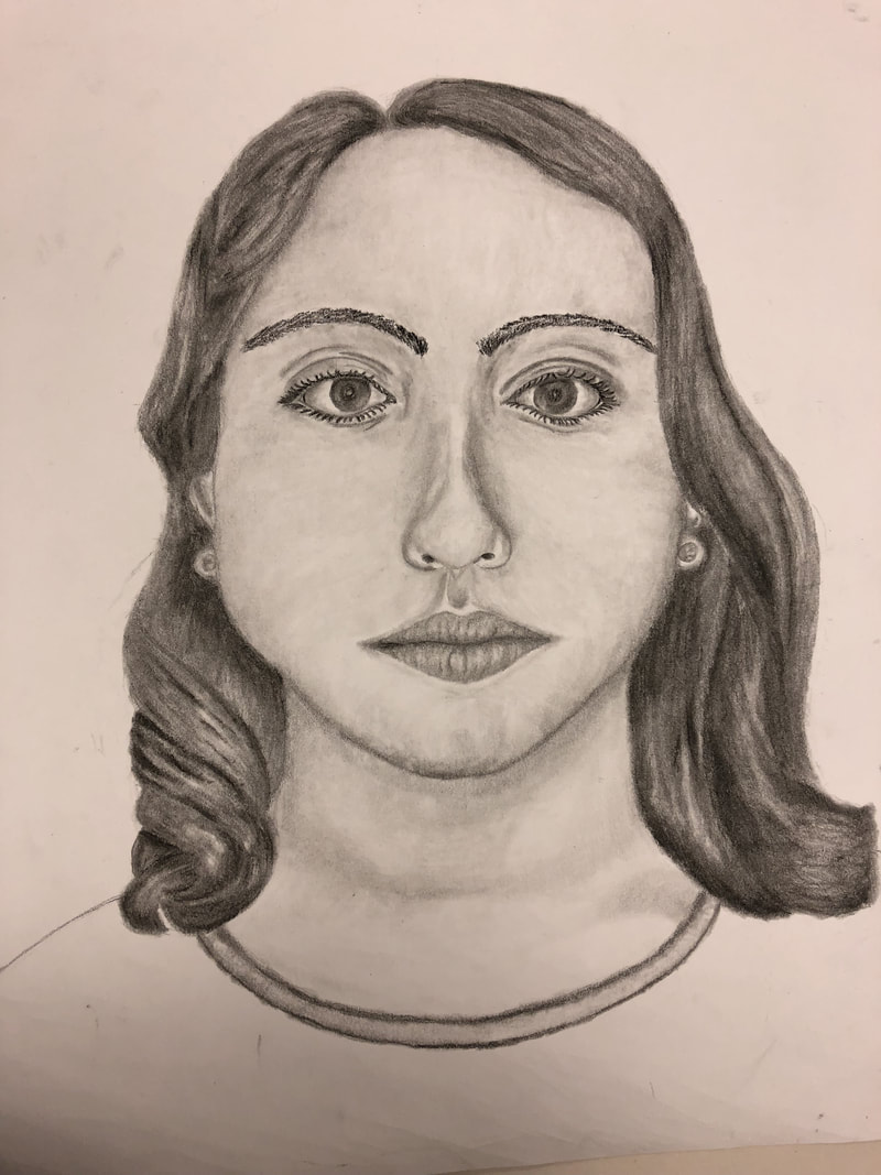
It was a tough and painful process because it took a while for me to get all the proportions right and to make sure the features were placed correctly. I had to first draw out generic shapes and then customize so that it could like me and from there I added value through endless layers of shading. 2. Explain how you found the different values in the portrait? I made the picture black and white so the shadows and highlights were noticeable, so when it came time for the drawing I could see all the values. By making the picture black and white, it made it easier for me to use a range of values and to incorporate all the shades and highlights in the drawing. 3. Did you achieve a full range of the different values within your portrait? How? I don't believe that I achieved a full range of different values within my portrait. The drawing seems to have a small range of values, mostly because I used the same few pencils. I did incorporate the highlights, however I feel as though I could have gone darker in the hair and the face. 4. Describe your craftsmanship. Is the artwork executed and crafted neatly? I believe that the hair was crafted neatly and certain aspects of the face, such as the nose, was executed well. However I feel as though the eyes didn't mirror the realism behind the picture, neither did the eye lashes, or lips. I think the face shape and neck was done neatly however it certainly could have been done better. Certain aspects like the ears, earrings and shirt weren't executed as well as I'd hope. 5. How were you able to capture your look? I think I truly captured my hair by focusing on the curls and the major hair placement. My eyes tend to be a little larger than normal size so I made sure to incorporate that along with the dark values of my lips. I even added in my own earrings so that I could capture my own look. 6. Explain how you made sure you had correct facial feature placement. I made sure to measure everything by one eye like I learned from Ms. Rossi, however even with that I think my placements were a little off because the drawing didn't quite look like me. I made sure to make the nose about an eye and a half long and the head to be about five eyes wide, however I had to alter these measurements because my face is a little different than an average face. 7. Explain the importance of learning how to draw all the features individually. By learning how to individually draw all the features, we were able to learn about different techniques to help us, and we could practice more with each feature. At first, the noses were really difficult but as a I practiced, I got better at them, along with lips and eyes. 8. What part of this unit was the most beneficial and why? The most beneficial part of this unit was learning how to correctly place all the features on the face. By learning how to measure the width of the face, and the length of the nose, and the distance between the lips and the nose, I was able to draw a more realistic face. Furthermore, learning how to place the feature of the face taught me how to get my proportions right. 9. List any obstacles you had to overcome and how you dealt with them. It was difficult to get the right face shape and it was even worse trying to make my drawing look like a realistic version of me. I struggled with creating realistic eyes, because I was worried to go dark and it was hard to see my irises in the picture, however I think I blended it to the best of my ability. It was also extremely hard to make the hair realistic, so I tried my hardest to add different values so it could show volume. 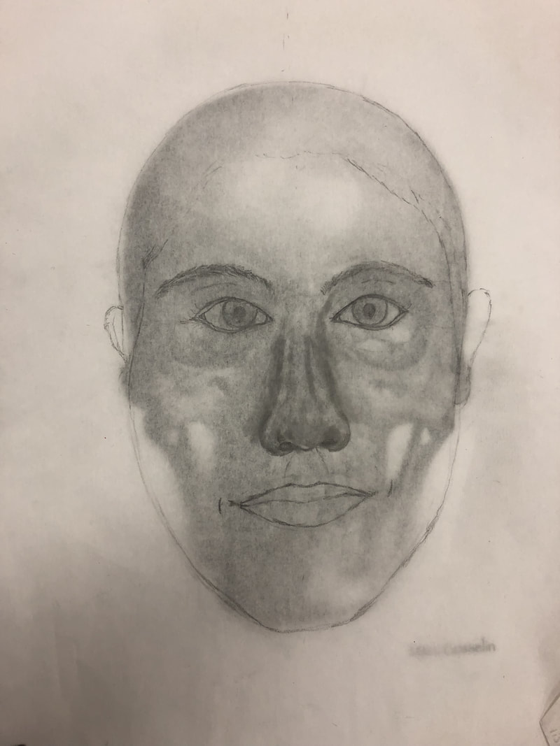 We traced over a skull in order to draw a realistic face and to learn how to fit everything on the face. I felt as though the skull underneath made my drawing worse because in reality my face isn't as elongated so this drawing doesn't quite look like me. However it did help me learn how to correctly place all the features of my face.
Eyes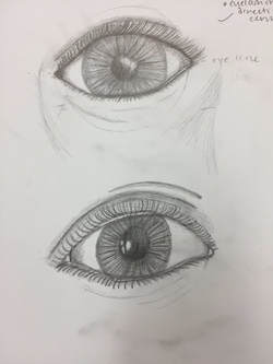 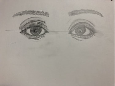 This was really difficult to do, and I feel as though the top eyes don't look very realistic. I should have added more value and maybe loosened up on pressure. When I drew both my eyes, I liked the right one a little more than the left. However, I don't really think that the eyes I drew look like mine. Nose
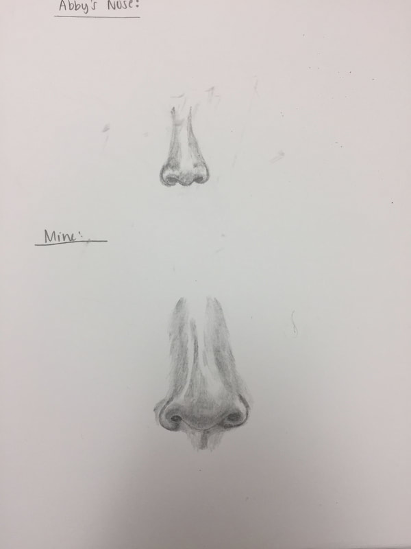
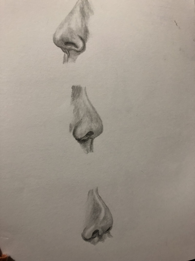
The struggle to draw Abby's and I's nose (left side) was real. I struggled to get all the values to blend together to create and even and realistic look, but I think as I practiced more with the ones on the right, I got better. I especially love the top and middle one on the right page because I think those ones turned out the best. Lips
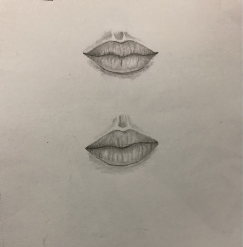
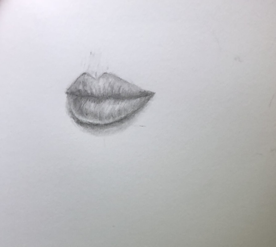
My lip drawings seem a little off to me, I think that some lines are a little stronger than I'd like them to be, but in general I do like how they turned out. The bottom one doesn't quite look like mine, and the angled one was very difficult to do and doesn't quite look realistic.
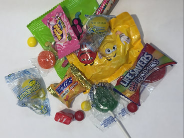
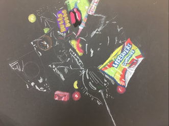
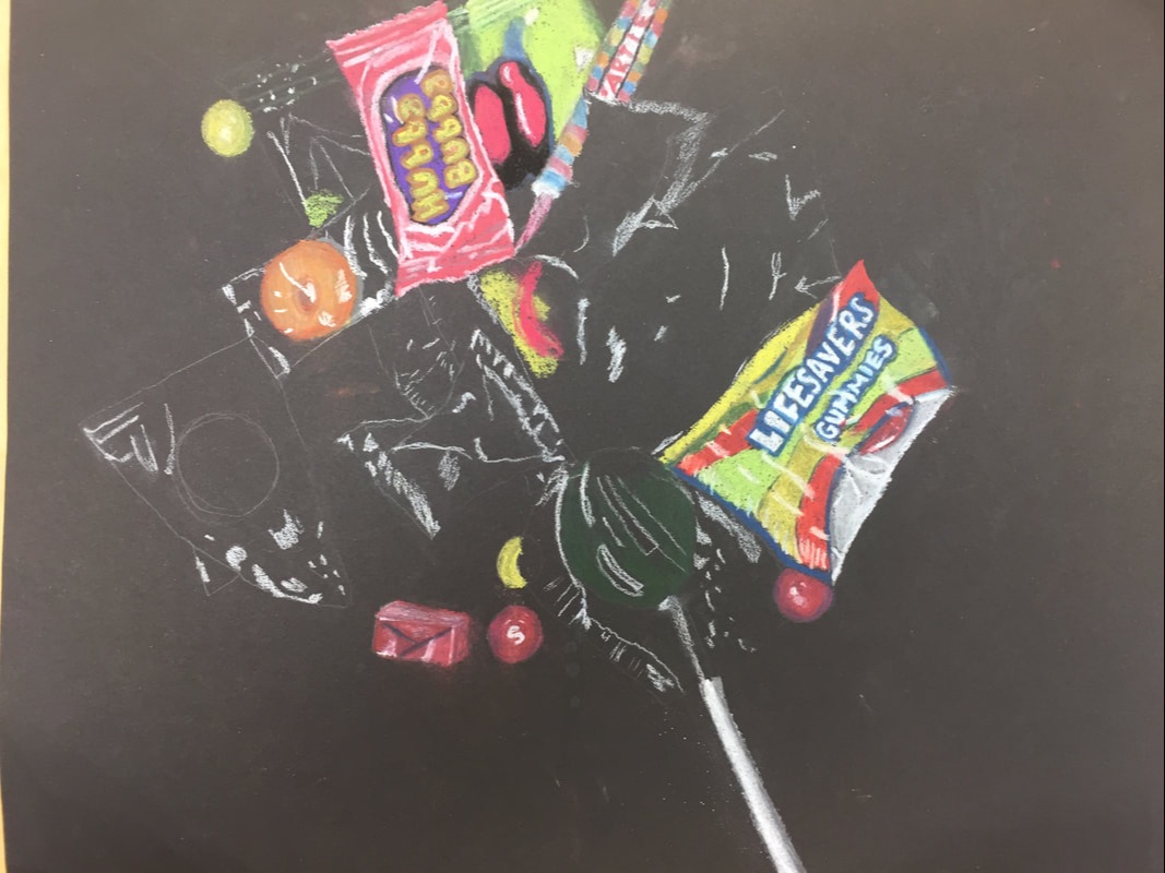
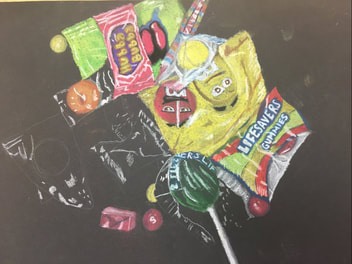 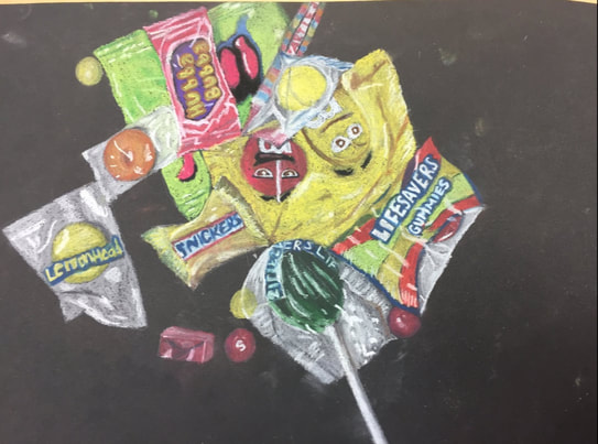 I used both chalk pastels and pastel color pencils in order to recreate the image from above. This project was really difficult due to how there weren't vast colors I could choose from, plus the color pencils and the chalk couldn't work well together. However I do like how on some pieces, like the Lifesavers lollipop or Lemonhead, the plastic covering is very obvious. I don't like how the M&M's or the Snickers turned out, because they seem really sloppy and the colors didn't turn out the way I wanted it to.
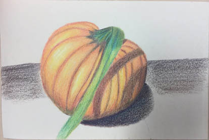 I feel as though the highlights of my pumkin are shown very clearly but the shadows aren't blended as well as I'd like them to be. I think I incorporated the different shades of yellow, orange and red on the pumpkin but I probably should have layered the shadows a little more. The surface on which the pumpkin is laying on and its shadow look a little weird and if I had a lot of time I would really like to fix it, but other than that I actually did enjoy prismas. 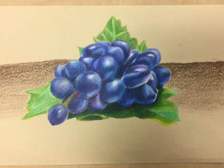 I'm very proud of how the grapes turned out because I feel as though they are really blended and I think I depict the volume of the grapes. I do wish that I had gone a little darker but I think I was scared that once I went dark I wouldn't be able to go back. This took such a long time but I'm in love with the final look of it all, although I do hate how the background turned out. 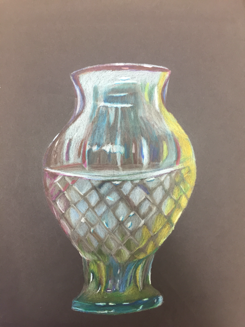 This was really a difficult project becuase it was hard to capture the form of the vase. Not to mention there were many highlights and colors and I don’t think I really captured all the highlights. But from a distance I genuinely like my drawing but when I get upclose I can see a lot of the imperfections and I probably should have layered a little more.
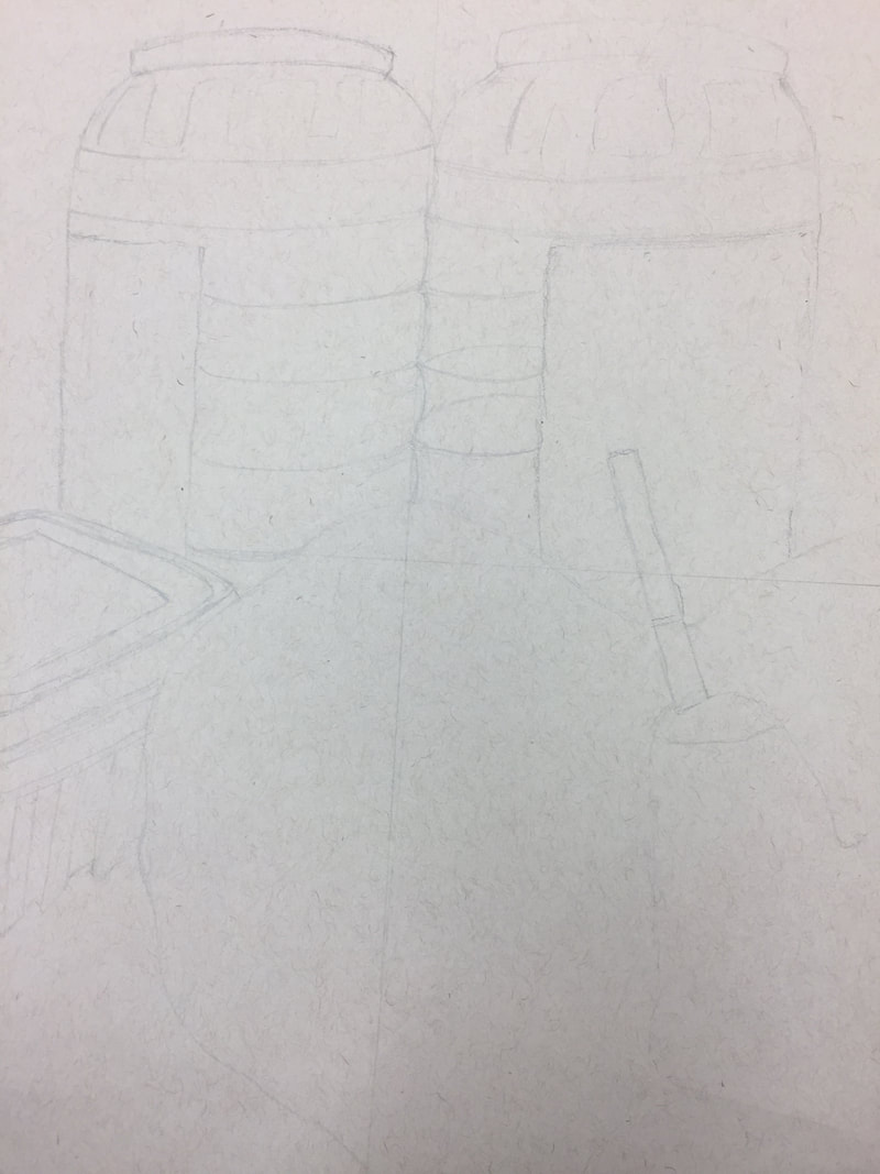
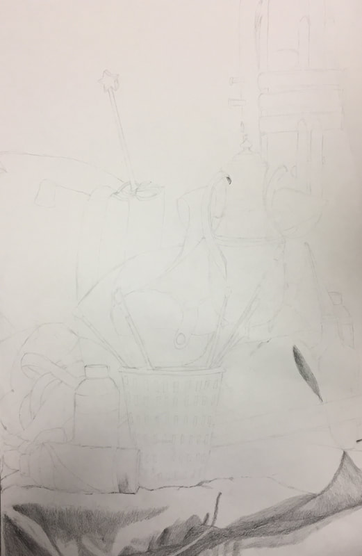
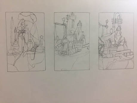 compositional sketch 1, 2 and 3
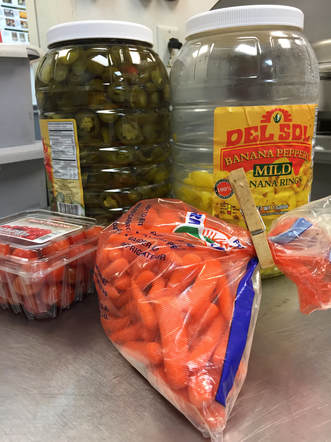
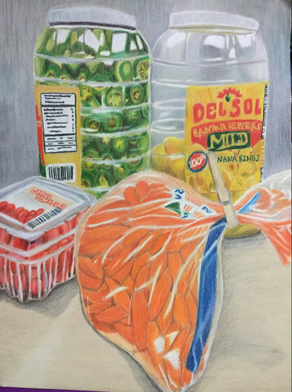
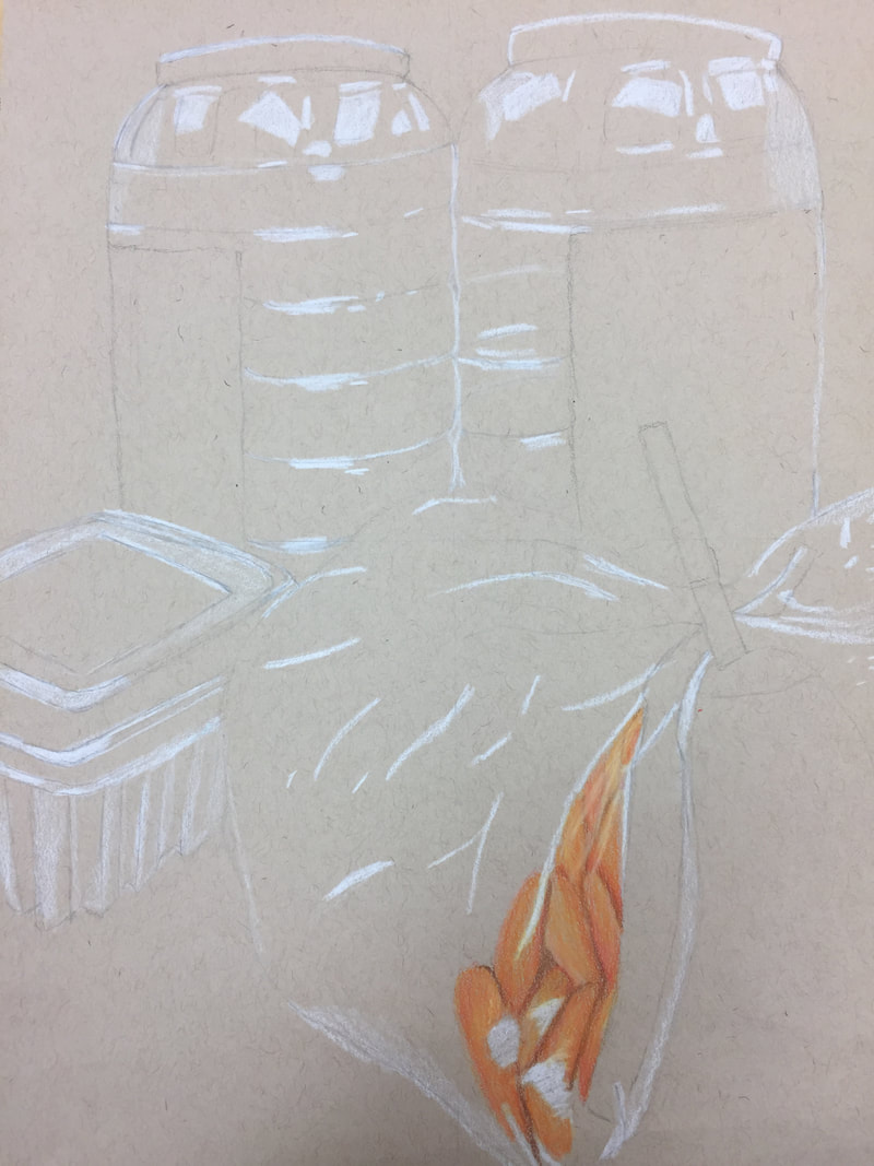
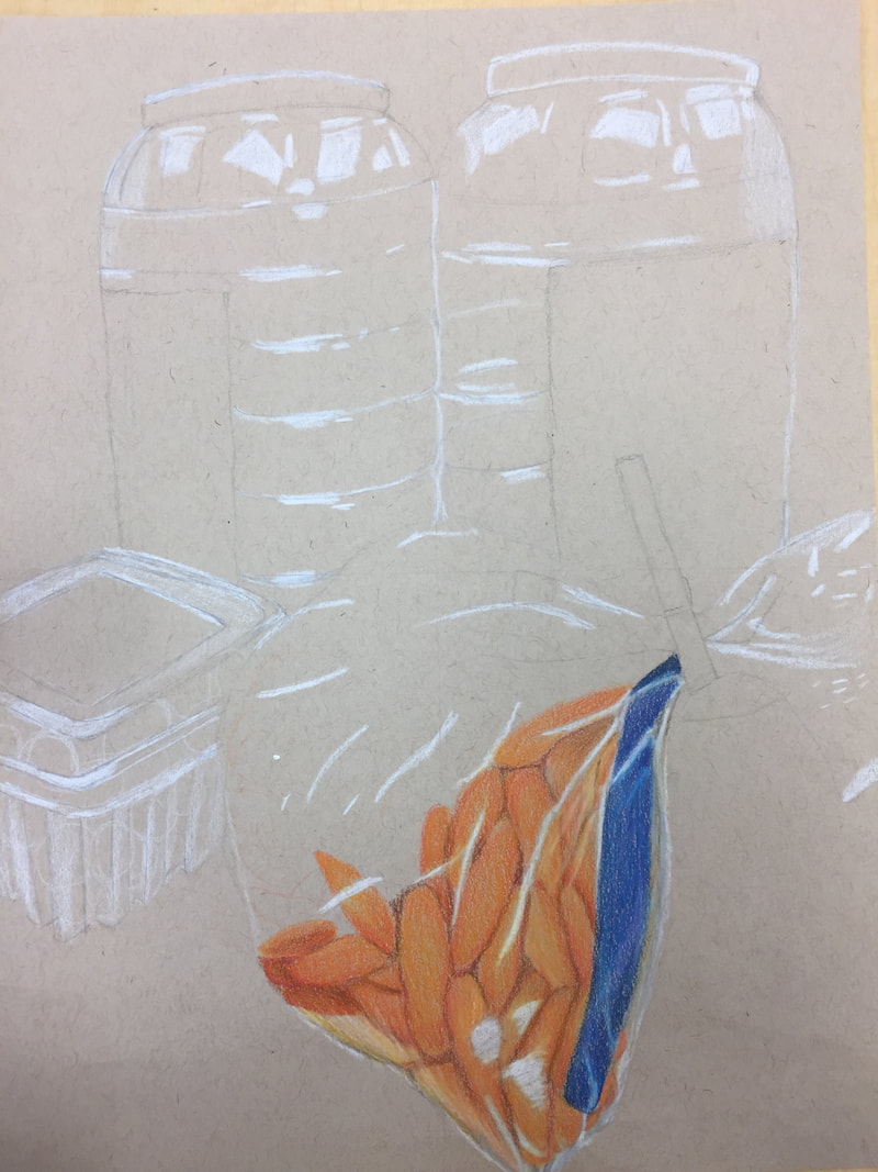
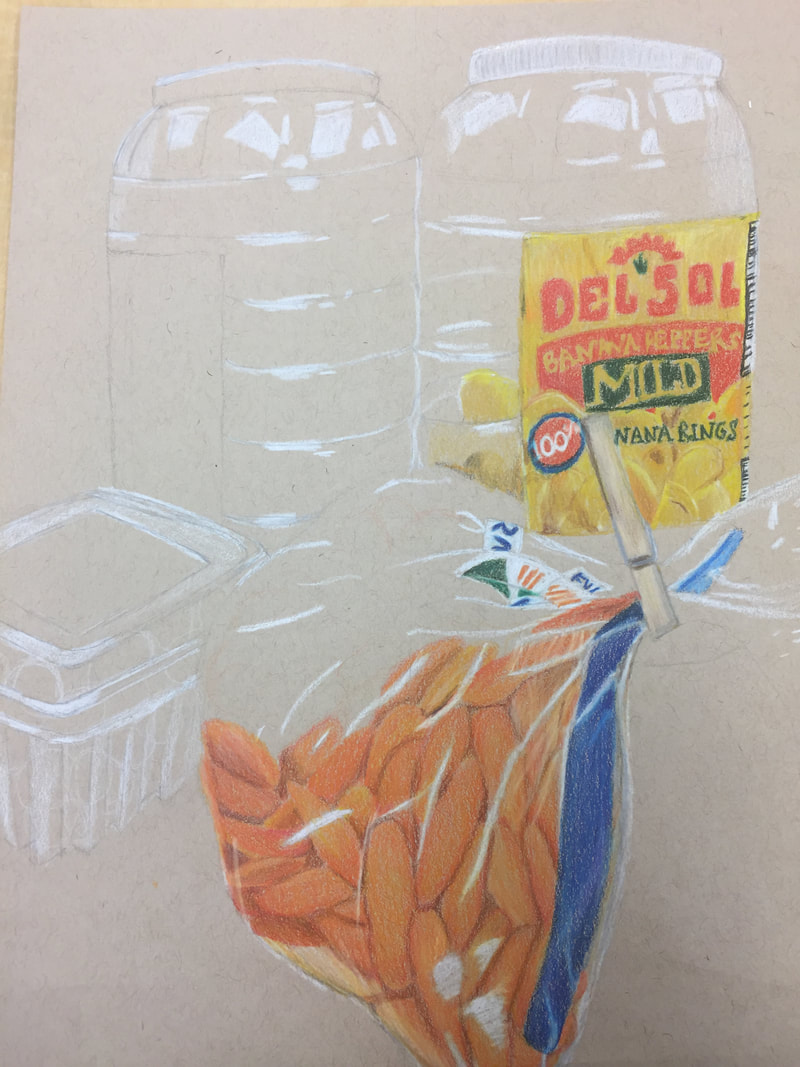
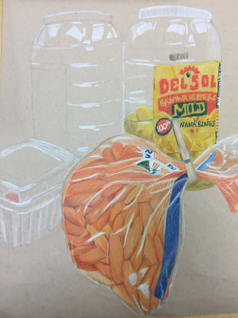
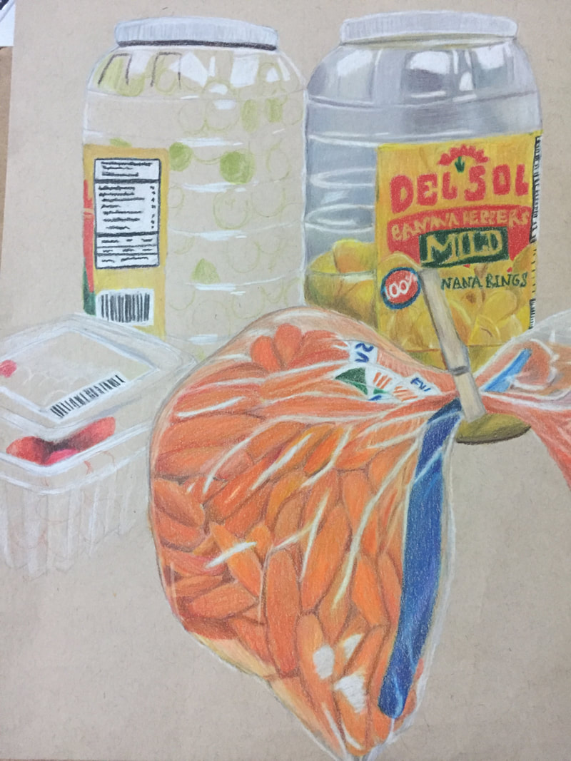
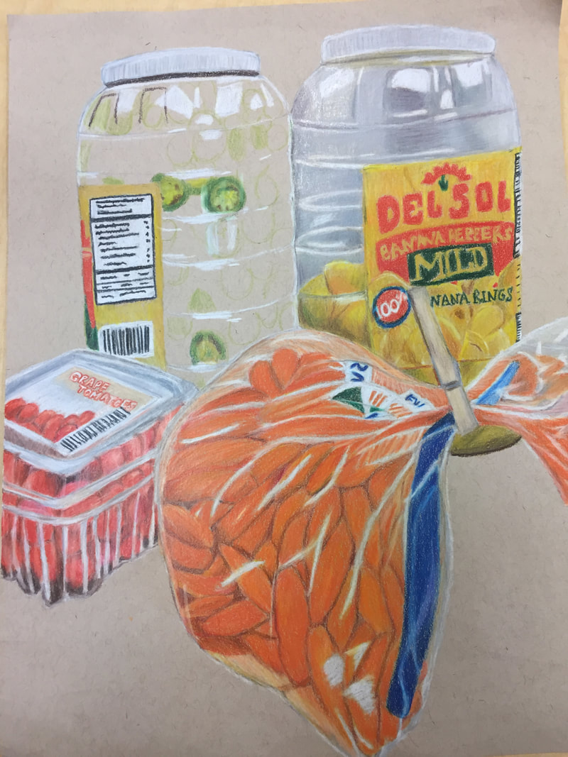
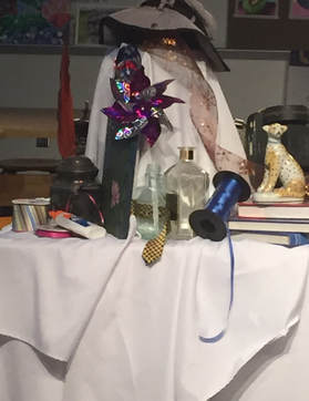
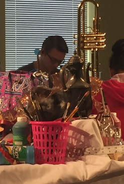
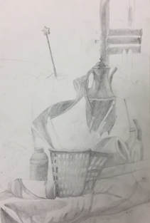
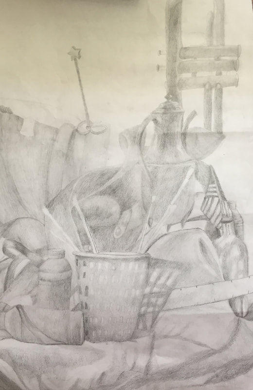
My in-progress pictures. 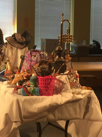 My reference picture for my final 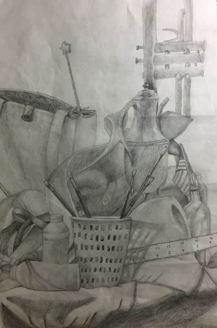 My final Describe the craftsmanship of your drawing. (Is it clear, clean edges, blended well, smudges, defined space, etc.)
I believe that my drawing is clear and has clean edges because I am able to see where different objects touch or go behind or come out from one another. I believe I blended the ribbon well and the bag and the instrument, however I could have done a better job blending the basket shadow and the fabric. I feel as though the container holding the mason jar could have been portrayed better. Are your values and shadows realistic? How many values did you include? How and why are values important? My values and shadows appear to be realistic because I used a variety to display how the objects appeared. I used dark values, which is evident through the fabric, the shadows and the paintbrushes and I used light values to demonstrate the highlights of certain objects like the ribbon and container. Values are important because they help demonstrate the depth of objects and they make the objects more realistic. Is there a clear source of lighting? I do believe that you can tell there is a clear source of lighting through my drawing. You can see that there is a shadow coming from the paintbrush container, plus the pot handle has a clear highlight which shows that the source of lighting is near the left. How important were the compositional sketches? Explain. The compositional sketches helped me focus my attention on one area of the table, which helped me on my final drawing. Not to mention, the different areas I sketched helped me see which area would be the best one to draw for my final, because when I drew the first compositional sketch, the cheetah was difficult to draw and I knew I would have a hard time really depicting it realistically. How is your final drawing successful? My final drawing is successful because I believe it realistically depicts what I saw. I think the pot was on of the best parts of the drawing because the highlights and the shadows all blend together well. Furthermore, I feel as though you can tell where one object ends and where the other one begins. Are the proportions, structure and perspective of the subject correct? In my opinion, the proportions aren't totally accurate, because the pot and the instrument's proportions are a little off. I struggled to really capture the size of the pot compared to the other objects, which then threw off the size of the instrument. I do feel as though I captured the perspective of the subject though. Does the placement & grouping of objects create a pleasing arrangement (composition)? I think the placement of the objects does create a pleasing arrangement, especially near the paint bottles and the shoe. Is there a center of interest and is it well located? I don't really feel as though there is a center of interest because there are too many objects in the center. There is the ribbon and the boot, plus the pot so I feel as though there is no center of interest in my drawing. How well did you manage your time and resources throughout the process of creating this drawing? Do you see where you could improve in this area? I feel as though I could have managed my time better in class because there were moments where I got a little distracted. I also feel as though I should have zoomed in more so there would have been less negative space and there would have been an actual object as the center of interest. What challenges did you encounter during this project and how did you overcome them? It was very difficult to get the size of the pot right compared to everything else but I slowly though about it and stared at the still life until I grasped the proportions. I also struggled with the different shades of the fabric, which is kind of evident, and I ended up using different shades of pencils to get all the values. What have you learned drawing a still life? I have learned that drawing a still life is not easy because you have to incorporate all the values and make sure the proportions and perspectives are right, otherwise it looks weird. |
AuthorWrite something about yourself. No need to be fancy, just an overview. Archives
January 2018
Categories |
 RSS Feed
