0 Comments
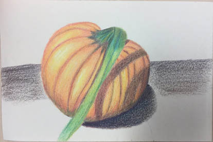 I feel as though the highlights of my pumkin are shown very clearly but the shadows aren't blended as well as I'd like them to be. I think I incorporated the different shades of yellow, orange and red on the pumpkin but I probably should have layered the shadows a little more. The surface on which the pumpkin is laying on and its shadow look a little weird and if I had a lot of time I would really like to fix it, but other than that I actually did enjoy prismas. 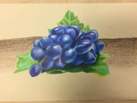 I'm very proud of how the grapes turned out because I feel as though they are really blended and I think I depict the volume of the grapes. I do wish that I had gone a little darker but I think I was scared that once I went dark I wouldn't be able to go back. This took such a long time but I'm in love with the final look of it all, although I do hate how the background turned out. 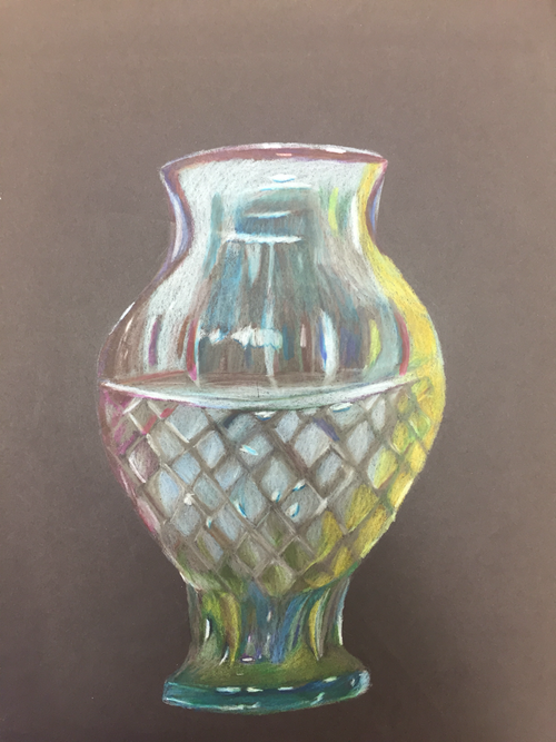 This was really a difficult project becuase it was hard to capture the form of the vase. Not to mention there were many highlights and colors and I don’t think I really captured all the highlights. But from a distance I genuinely like my drawing but when I get upclose I can see a lot of the imperfections and I probably should have layered a little more.
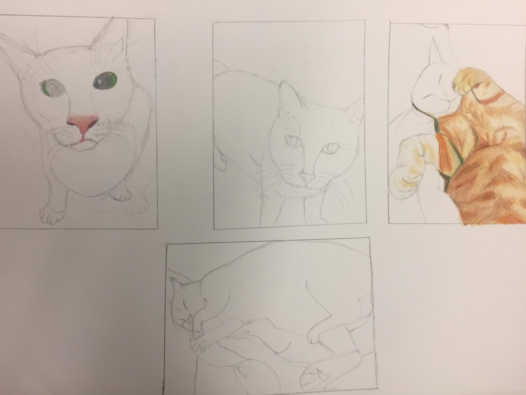
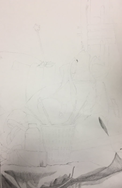
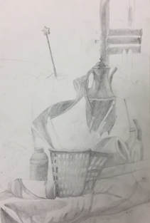
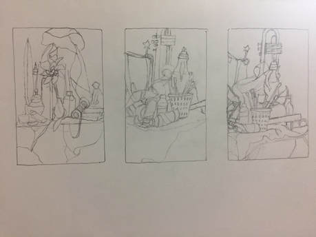 compositional sketch 1, 2 and 3
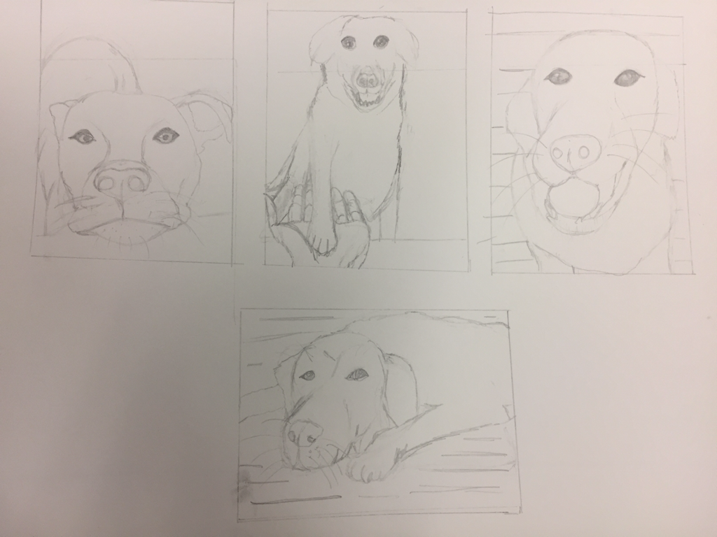
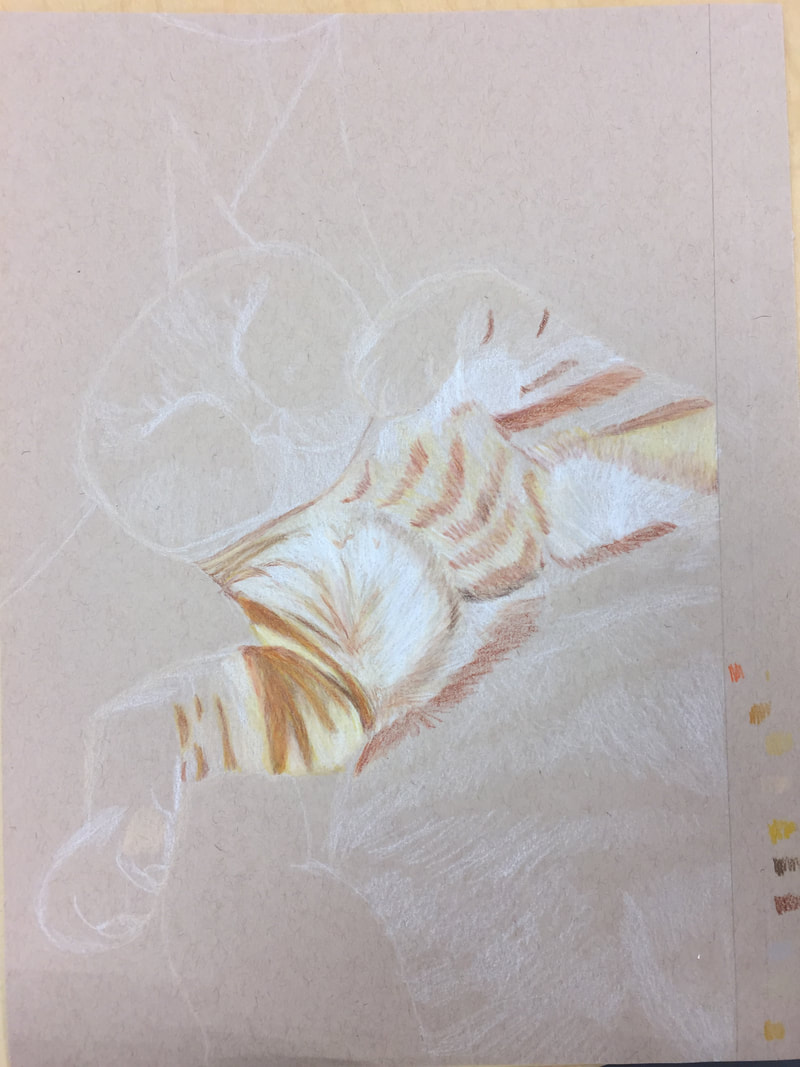
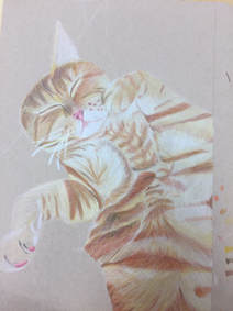
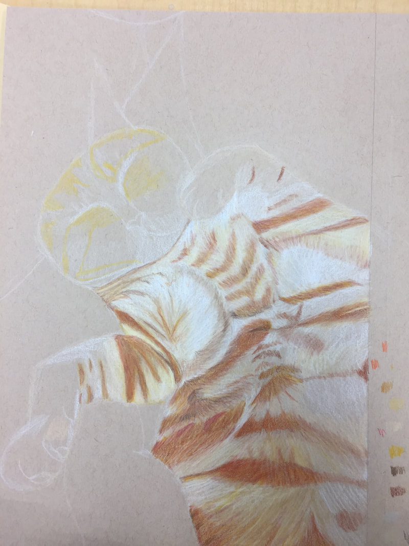
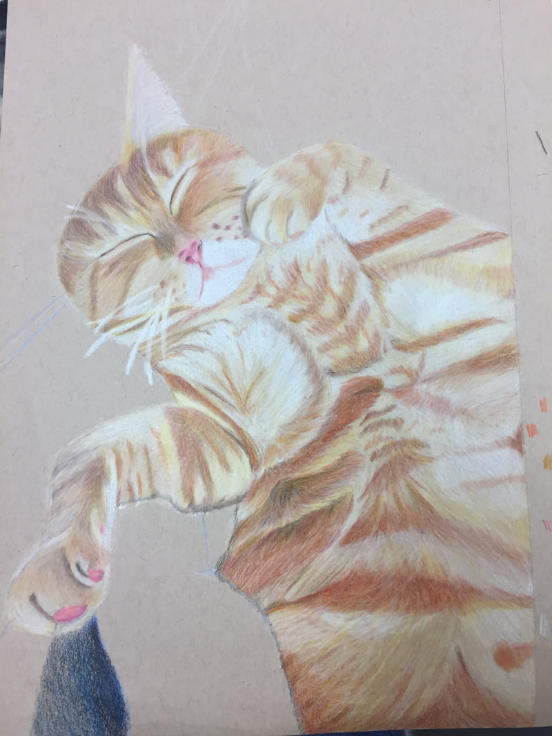
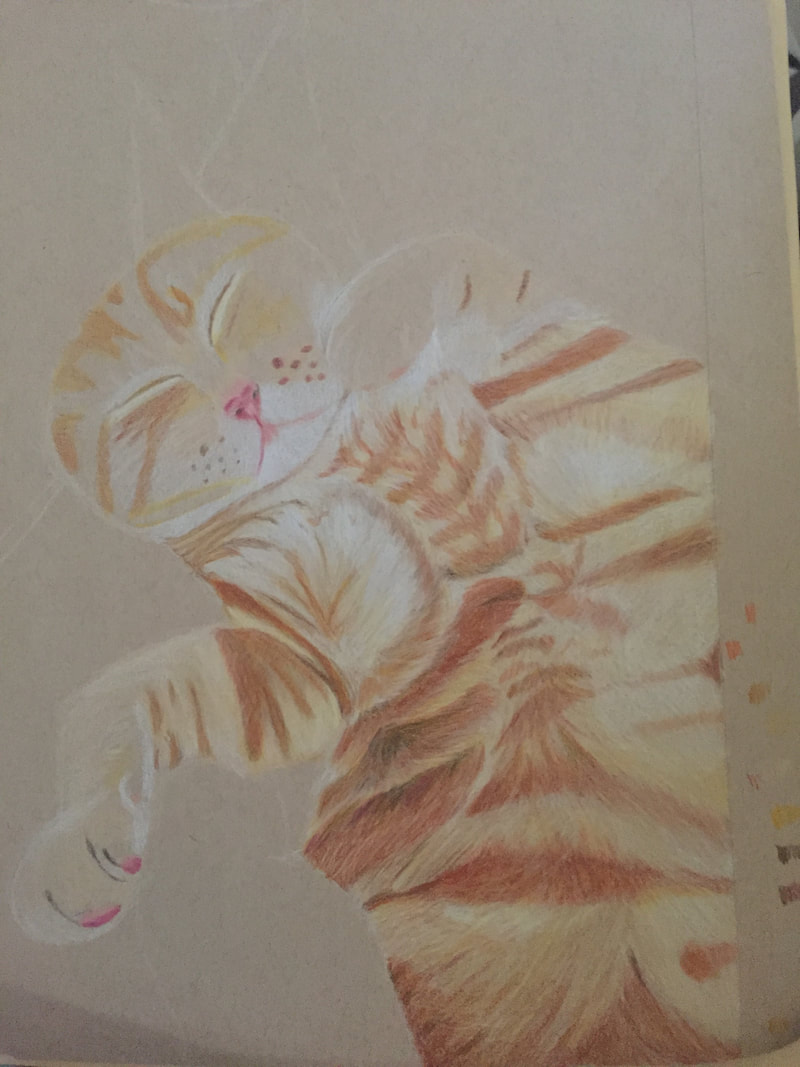
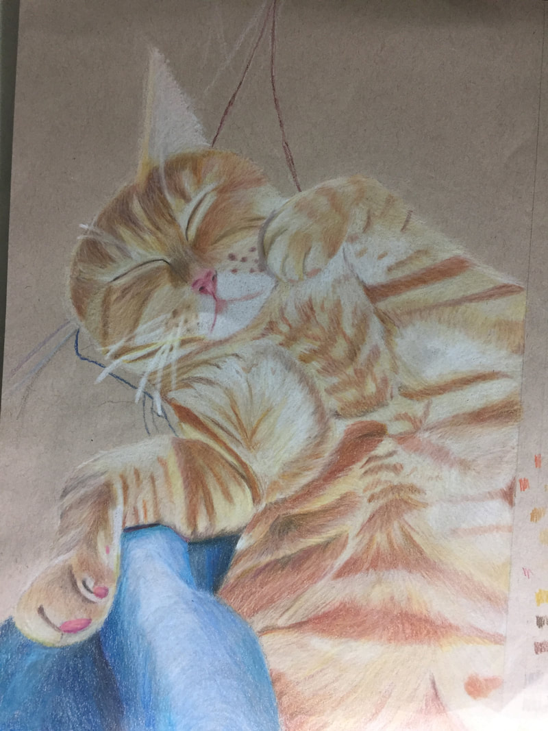
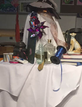
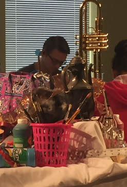
My in-progress pictures. 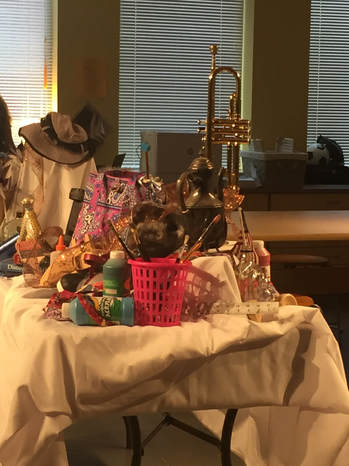 My reference picture for my final 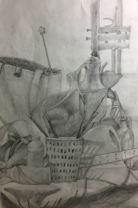 My final Describe the craftsmanship of your drawing. (Is it clear, clean edges, blended well, smudges, defined space, etc.)
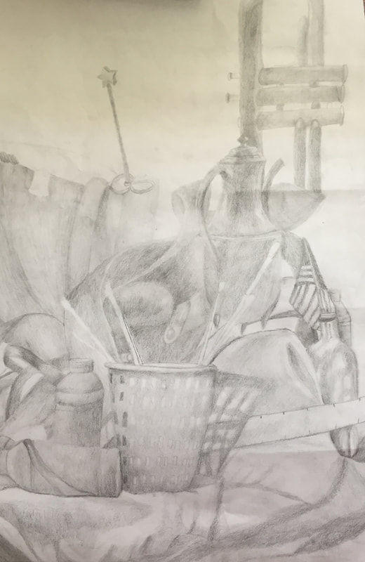
I believe that my drawing is clear and has clean edges because I am able to see where different objects touch or go behind or come out from one another. I believe I blended the ribbon well and the bag and the instrument, however I could have done a better job blending the basket shadow and the fabric. I feel as though the container holding the mason jar could have been portrayed better. Are your values and shadows realistic? How many values did you include? How and why are values important? My values and shadows appear to be realistic because I used a variety to display how the objects appeared. I used dark values, which is evident through the fabric, the shadows and the paintbrushes and I used light values to demonstrate the highlights of certain objects like the ribbon and container. Values are important because they help demonstrate the depth of objects and they make the objects more realistic. Is there a clear source of lighting? I do believe that you can tell there is a clear source of lighting through my drawing. You can see that there is a shadow coming from the paintbrush container, plus the pot handle has a clear highlight which shows that the source of lighting is near the left. How important were the compositional sketches? Explain. The compositional sketches helped me focus my attention on one area of the table, which helped me on my final drawing. Not to mention, the different areas I sketched helped me see which area would be the best one to draw for my final, because when I drew the first compositional sketch, the cheetah was difficult to draw and I knew I would have a hard time really depicting it realistically. How is your final drawing successful? My final drawing is successful because I believe it realistically depicts what I saw. I think the pot was on of the best parts of the drawing because the highlights and the shadows all blend together well. Furthermore, I feel as though you can tell where one object ends and where the other one begins. Are the proportions, structure and perspective of the subject correct? In my opinion, the proportions aren't totally accurate, because the pot and the instrument's proportions are a little off. I struggled to really capture the size of the pot compared to the other objects, which then threw off the size of the instrument. I do feel as though I captured the perspective of the subject though. Does the placement & grouping of objects create a pleasing arrangement (composition)? I think the placement of the objects does create a pleasing arrangement, especially near the paint bottles and the shoe. Is there a center of interest and is it well located? I don't really feel as though there is a center of interest because there are too many objects in the center. There is the ribbon and the boot, plus the pot so I feel as though there is no center of interest in my drawing. How well did you manage your time and resources throughout the process of creating this drawing? Do you see where you could improve in this area? I feel as though I could have managed my time better in class because there were moments where I got a little distracted. I also feel as though I should have zoomed in more so there would have been less negative space and there would have been an actual object as the center of interest. What challenges did you encounter during this project and how did you overcome them? It was very difficult to get the size of the pot right compared to everything else but I slowly though about it and stared at the still life until I grasped the proportions. I also struggled with the different shades of the fabric, which is kind of evident, and I ended up using different shades of pencils to get all the values. What have you learned drawing a still life? I have learned that drawing a still life is not easy because you have to incorporate all the values and make sure the proportions and perspectives are right, otherwise it looks weird. |
AuthorWrite something about yourself. No need to be fancy, just an overview. Archives
January 2018
Categories |
 RSS Feed
