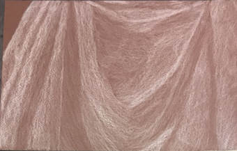
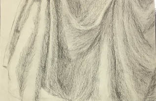
 white prisma 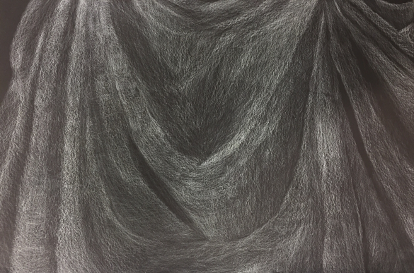 my final with white prisma 1. Did you use a wide range of values? (A range from white to black with at least 9 values). Explain how is this evident? I don't feel as though I used a wide range of values because there are certain areas where I should have gone lighter but I didn't. But I feel like I did well with the darker values, like at the folds, however I wish I had blended the lighter and darker values together a little more. 2. Explain how your knowledge and creating practice studies with value contributed to your piece. I never used prismacolors before so practicing with it really helped me understand value when it comes to prismas. My practice studies really taught me to shade and thoroughly blend the different values so that they look blended. 3. Describe the blending and transitions in your fabric (discuss your use of pressure with pencil/colored pencil/charcoal pencil and other techniques to achieve this). I felt as though I started out blending pretty well but then I gradually lost control of the pressure at certain points. Its really easy to notice where I lost control because the transition from the lighter to darker values isn't very smooth. 4. Explain how your interpretation of texture is essential in capturing the look of the object. I interpret texture as how you imagine an object feels and this object in particular hat a smooth texture, so I knew I had to enrapture that. I had to use the right control of pressure in order to truly blend the shades so that the creases and folds looked smooth and not rough, and I feel as though I kind of accomplished that but I could have done a better job. 5.If you could recreate your pieces what would you do differently to enhance the final outcome? I would most definitely go back and work on it slowly because I think I rushed a little bit in the end so the piece doesn't look as good as I hoped it would. I would also add consistent layers so that I really employ all the values I can. Additionally, I would control my use of pressure in order to get a better transition between the different values.
0 Comments
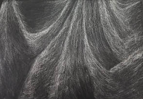
 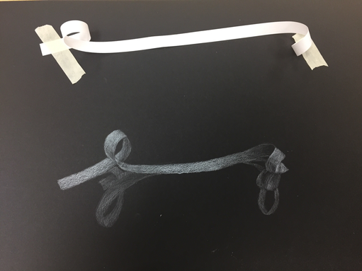 I really liked how my ribbon turned out, even though I struggled to really get the shadows. I wish I had faded the different shades in so that it looks more blended. I like using the primsacolor pencil compared to the charcoal, because it felt much easier to use in my opinion.
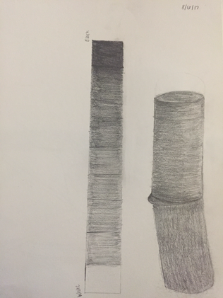
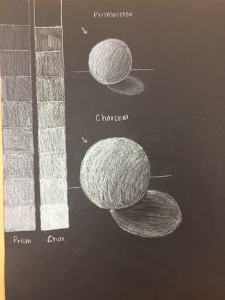
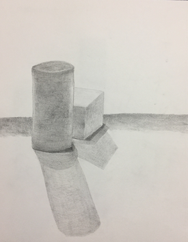
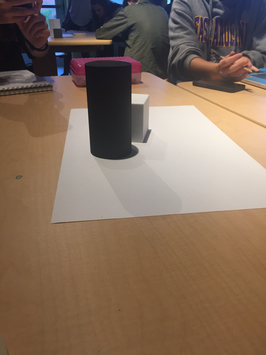
This value practice drawing was harder than it looked. I struggled to blend the different shades together but in the end I think it looks pretty good. I learned how to effectively apply different pressure and blend the shades.
 One of my practice drawings  My final
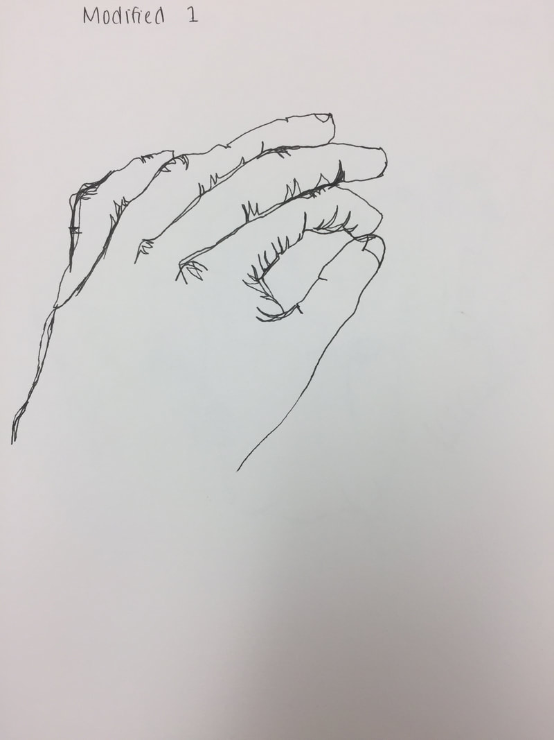
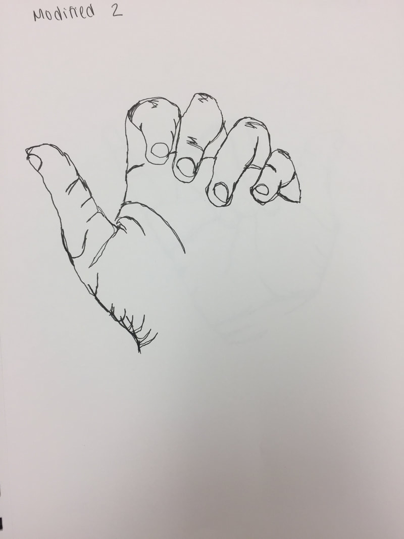
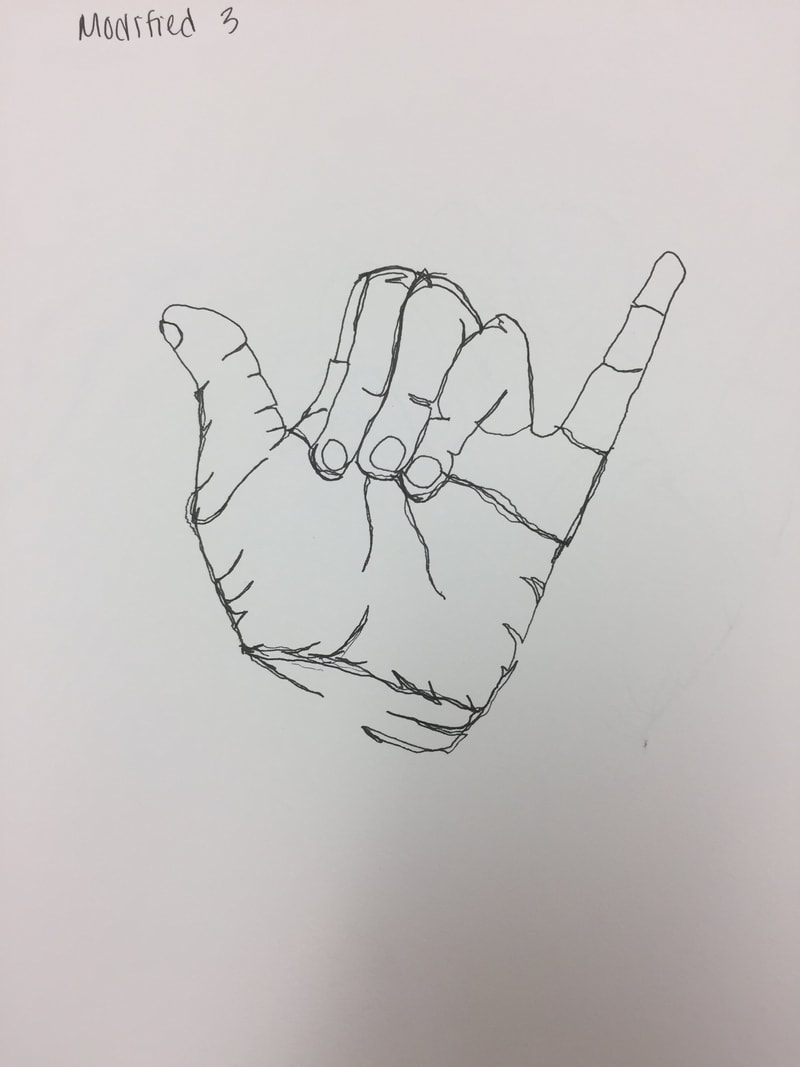
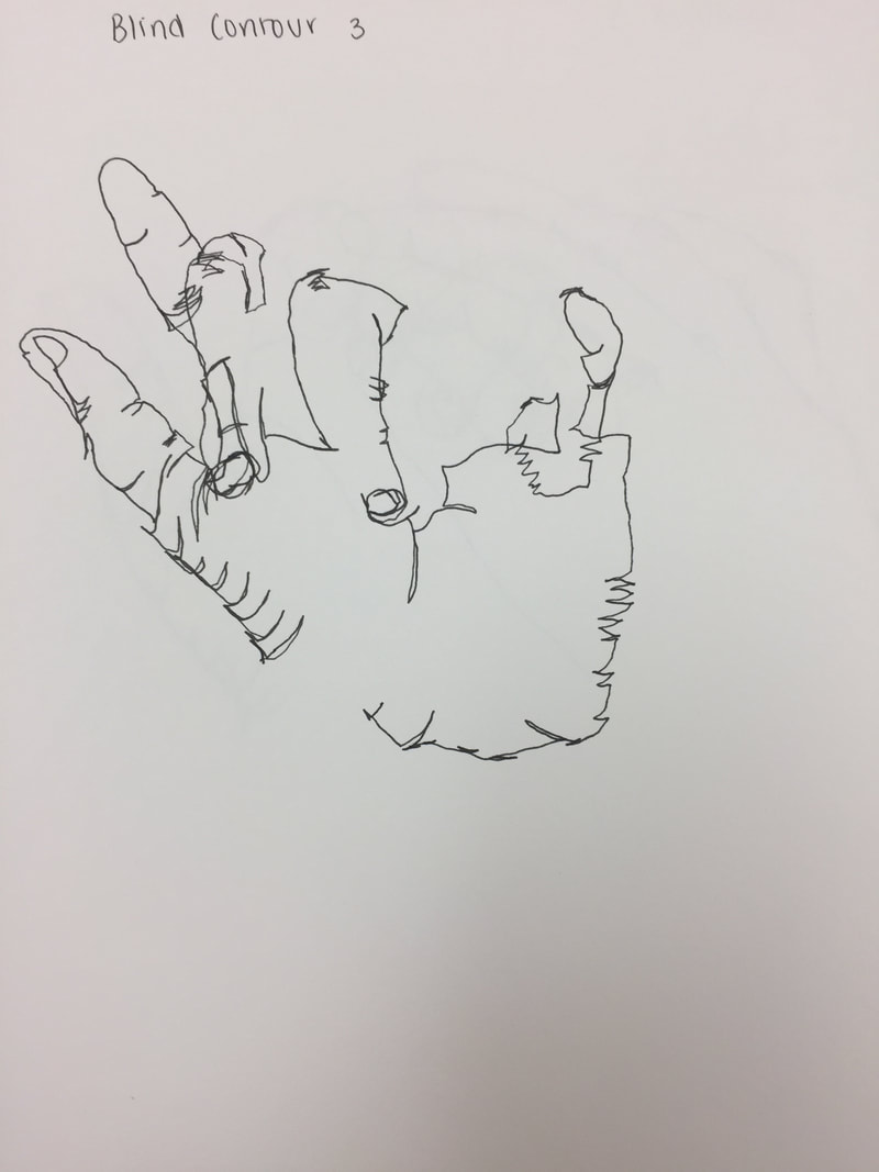
For the modified contour hand drawing, we still couldn't lift our pen off the paper but we were able to glance at our paper to see if our drawing was more accurate. My least favorite drawing is probably the first one because the way I drew my hand makes the hand position look awkward. My favorite is the third modified drawing because I can tell the depth of my hand and I really liked how I got all the creases on my hand.
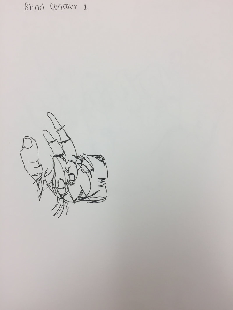
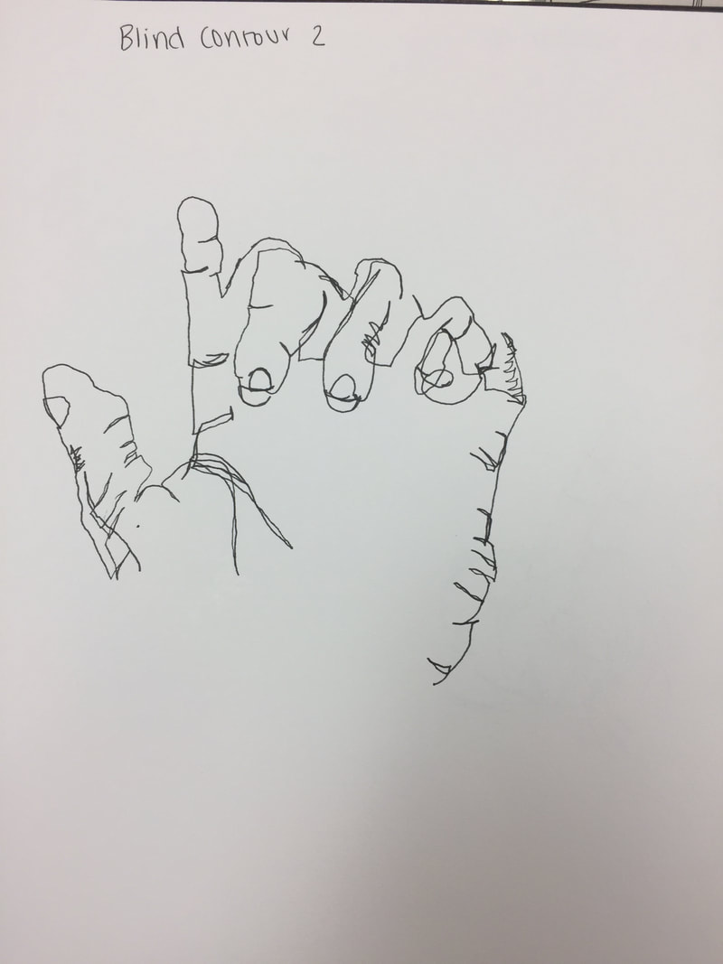
For this exercise, we turned away from our sketchbook and had to draw our hand without lifting our pens or looking at our paper. My first one was the worst one because I went too fast and made my hand too small and I feel as though my second one was probably my best, it looks closest to a real hand. I'm kind of disappointed by my third one though, because I expected it to look a little better than my second one, but it turned out worse.
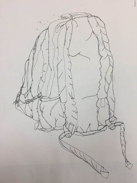 My group chose to draw my backpack, and I was forced to do the backside of it. It was really difficult to draw it all without lifting my pen but I kind of like how it turned out, especially the front part of my backpack. I didn't like how the backside underneath the straps looks kind of stiff and I wish I had added more depth to it.
|
AuthorWrite something about yourself. No need to be fancy, just an overview. Archives
January 2018
Categories |
 RSS Feed
